Veritas Magazine (2022)
Typography | Visual Composition & Layout | Brand Identity | Colour Theory
Design Brief | Masthead | Magazine Cover | Magazine Articles | Design Rationale | Reflection
Project role:
Graphic Designer (Individual class project)
- Created all project deliverables: designed the layout; created vector graphics; sourced and edited raster images; sourced and applied typefaces/fonts and colour schemes
Programs used:
Adobe InDesign, Adobe Photoshop, Adobe Illustrator
Key skills demonstrated:
Strategic creation and use of colour, typography, imagery, and layout | Brand identity | Creative thinking | Visual problem-solving | Visual communication
This is a magazine design project during my Typography class (MDIA 1920) at BCIT, where we had to create our own design compositions for the masthead, issue cover, and article spreads of a fictitious scholastic magazine called 'Veritas'.
Design Brief
About the Company
- Company Name: Veritas
- Service(s): Magazine publication
- Mood: Scholastic yet modern
Target Market/Audience
- Primary demographic: Canadians, all genders, age 45+
- Secondary demographic: Canadians, all genders, ages 25-45
- With post-secondary education (undergraduate and graduate degrees)
- Urban setting
Project Goals & Objectives
- To create a full magazine design (masthead, cover, and spreads) according to specifications (*see key project deliverables)
- To create a template for all further issues
- The grids have to be flexible enough to accommodate any kind of future content
Key Project Deliverables
- Masthead design (type exploration)
- 16-page magazine layout including the cover, 9” x 12”, full colour
- Must use ALL text provided – do not add or delete anything; clean text up (punctuation, spacing, etc.)
- Utilize parent pages, style sheets, grids, and page numbering
Masthead
previous | back to top | next
Type Exploration
For the type studies, I explored different fonts to reflect the magazine identity, and the meaning of the word ‘Veritas’ (which is 'truth' or 'reality' in Latin) appropriate for the content and target audience. I ended up with over a hundred typeface variations to sufficiently see different ideas and perspectives for the masthead.


Final Masthead Type Design
Designed by Philip Bouwsma, Luminari is a display font published by Canada Type. Luminari is an amalgam of High Middle Ages writing, a blend that combines the ornate Church hands with the simple Carolingian from the ninth to the fifteenth centuries.
I chose this typeface as its elegant forms reflect the scholastic nature of the magazine. Furthermore, the latin name 'Veritas' would benefit from being visually interpreted using a display font that imitates a dated period (i.e., the Middle Ages). With the use of tracking and kerning techniques, I was able to make each letter more distinct and readable.
Magazine Cover
previous | back to top | next
Thumbnail Layout Sketches
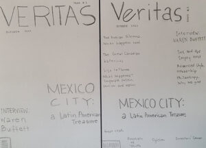
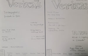
I sketched out a few different layout designs for the three magazine covers that were required to create for the project–taking into consideration the masthead design, the issue number and date, the text content provided (which cannot be altered), the recurring sections of the magazine, and the barcode.
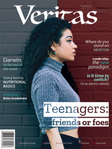
Final Magazine Cover Design
Typography
1) Zilla Slab Highlight
- A contemporary slab serif with a sophisticated industrial look
- Used for the issue's headline for its bold and modern design
2) Myriad Variable Concept
- A humanist sans-serif with large variations of width and weight, slant, and other attributes
- Used for the rest of the magazine cover due to its many font variations
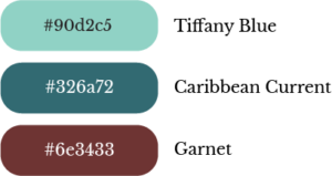
Colours
Clash colour scheme
- Red, Blue and Blue-green
- for a young and trendy look, as the main headline pertains to teenagers
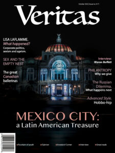
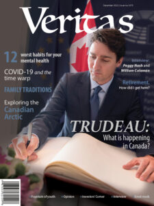
Other Magazine Covers
Typography
1) Oriya MN
- A humanist sans-serif
- Used for the issue's headline to make it stand out from the rest of the text
2) Myriad Variable Concept
- A humanist sans-serif with large variations of width and weight, slant, and other attributes
- Used for the rest of the magazine cover due to its many font variations
Colours
Analogous colour scheme
- Blue, Red-Violet, Tint of Red, Tint of Red-Orange
- for a traditional and elegant feel highlighting an important architecture of Mexico City for this issue's front cover
Colours
Analogous colour scheme
- Blue, Red-Violet, Red
- for a traditional yet elegant look, which is appropriate for the serious tone of the magazine headline in this issue
Magazine Articles
previous | back to top | next
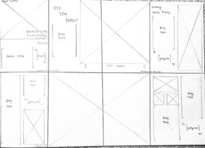
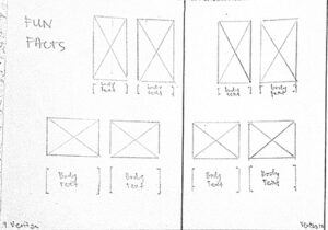
Thumbnail Layout Sketches (Spreads)
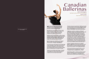
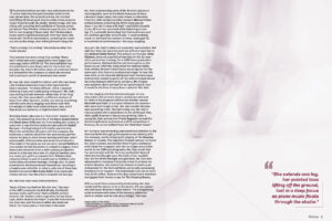
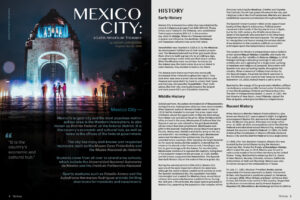
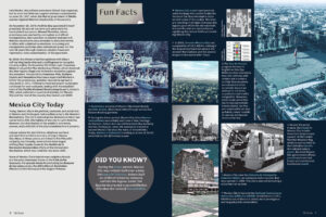
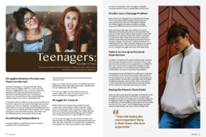
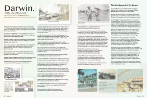
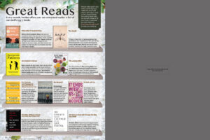
For the magazine spreads we were required to set and apply grids that will serve as a template for the rest of upcoming magazine issues. We have the option to use modular or hierarchical grids. I used a modular grid type for the Mexico City article's 'Fun Facts' section (pages 6 & 7), as well as for the 'Great Reads' section (page 12). I applied a 2-3 column hierarchical grid types for the rest of the magazine content.
Final Design (Full Magazine Issue)
Typography for all magazine articles
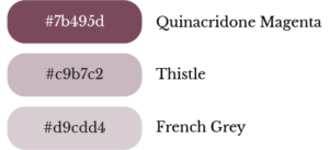
Monochromatic colour scheme for a calm and trendy look (tints and shades of red)
Analogous colour scheme for a traditional yet elegant look (tints & tones of blue, blue-green and green)
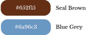
Complementary colour scheme for a traditional yet bold & loud look (shade of orange/brown and blue)
Analogous colour scheme for a traditional and elegant look (yellow, yellow-green, green & blue-green)
Analogous colour scheme for a traditional and elegant look (tints of red, orange, yellow, & green)
Design Rationale
previous | back to top | next
1) What is the Focal Point & which Principles of Design have you applied to make the composition work well?
A. Focal Point:
- The intended focal point is the main image chosen per cover, page, or spread.
- Principles of contrast (size, shape, value, saturation, position) and alignment were used to make the composition work well. The Rule of thirds was also used for the focal point.
B. Proximity:
- Such was used for grouping together an image with its respective source credits (usually vertically placed on the bottom-left corner of an image; also done for associating each 'Fun Fact' description (pages 6 & 7) to its respective image reference
C. Repetition:
- There was repeated consistency in formatting paragraph & character styles (just with a bit of colour variety) for headers, subheads, byline, body copy, pull-quotes, credits, etc.
D. Alignment:
- Groups of text and vector & raster graphics were aligned to each other to create harmony; mainly used left-alignment on text elements, with a few that have right-alignment depending on page layout nuances.
E. Contrast:
- Was applied by using different weights, size, and colours on the text; and, adding vibrancy for the images against a plain background
F. Balance:
- Asymmetrical balance (informal) was used for a modern vibe, which is fitting for an urban setting
2) What is the Hierarchy of the Design—What would you & the client want the audience to view next after the focal point and what after that, etc.?
- After the focal point, the next read should be the article headline with the byline, followed by section heads, then the pull quote/s or texts which were emphasized by having different character style/s from that of the body text, and finally the rest of the body text.
3) How have you used colour: Which function(s) of colour are you applying?
A. Colour that Evokes Emotion
- The respective colour symbolisms applied tend to evoke a range of emotions from its audience.
- For example, red expresses excitement, passion and intensity, while blue & green are soothing, refreshing, restful, and calming. Pinks tend to make one feel optimistic, soft, and sweet. Browns (shades/tones of orange & red-orange) are earthy, rustic, and outdoorsy/rugged.
B. Colour that Attracts the Eye
- The more saturated colours on certain design elements per cover, page, or spread gives contrast and interest to the layout
C. Colour that Organizes Content
- The text elements in more vibrant colours stand out from the rest of the text that are black/white by majority. This way, they are set apart from the rest and are given more emphasis so that readers can easily skim through the contents of the magazine while being able to take-in the highlighted information.
4) Who is the Target Audience and what have you done to attract this audience to your design?
- As mentioned in the design brief, the primary demographic are Canadians age 45 and up, all genders with post-secondary education (undergraduate and graduate degrees) in an urban setting. The secondary demographic are from the same cohort except that they are younger at ages 25-45.
- I applied eye-catching yet professional-looking design elements (such as the raster/vector graphics, typefaces/fonts, and colours used in this particular project) with a modern flare (asymmetrical balance and geometrical shapes) to go with an urban setting, in order to attract such type of target audience.
Reflection

This project was truly a test of skill and patience as a lot of thought and attention-to-detail had to go into designing it, which may not look as obvious to some. Several challenges were presented starting from the design brief itself: (1) a fixed amount of text was given to be cleaned up from typographical errors and to be fitted in exactly 16 pages (including the cover), without adding or deleting any of it, along with the images and other graphics that had to be sourced and applied; (2) was only allowed to use a maximum of two typefaces for the cover and articles separately; (3) ‘Typographic sins’ (e.g., certain modifications, wrong indentations, type ‘orphans’ and ‘widows’) were absolutely forbidden; (4) must use Adobe InDesign functions of parents pages, style sheets, and page numbering; and, (5) must use grids for the layout. Fortunately, this complex project was broken down into different ‘milestones’ to be completed over a number of weeks.
The first milestone was for the masthead design. I really enjoyed the type exploration bit as it taught the best practices in researching and trying out different typefaces and fonts to fit a particular design.
Then the second milestone for the cover design was quite challenging as I had to find copyright-free images that will go well with each of the issue’s headline, search for up to two appropriate typefaces to use, and to arrange all design elements in a layout that worked well and was replicable for subsequent issues.
Finally, the third and last milestone for the magazine articles was the most tedious of all, to say the least. However, I didn’t mind the complexity of it as I got so inspired searching for images that would suit the narrative of each article (which I find very interesting), editing them as needed, and incorporating them with the text and other graphics into the predetermined grid layout. I even ended up applying some kind of themes per spread to add a certain feel and some dramatic flair to each article or section.
Overall, I was pretty satisfied about the results of all the hard work I put into completing this project. I had the privilege to present my work in class and get positive feedback from my classmates and instructor. And for this Typography class at BCIT, I feel honoured to receive a final grade of 95%.

