
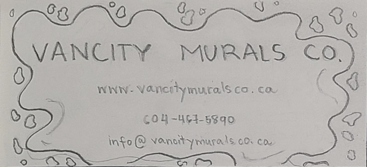
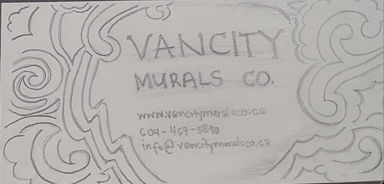
Initial Logo Design
At first I used the 'Brim Narrow Combined 1' font for the logo word mark, a decorative typeface, which I thought would look distinctive as it somehow resembles the look of a wall siding in relation to the 'mural' aspect of the brand.
![]()
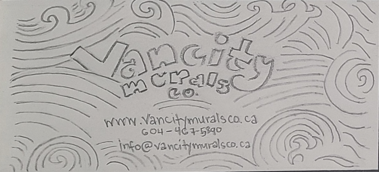
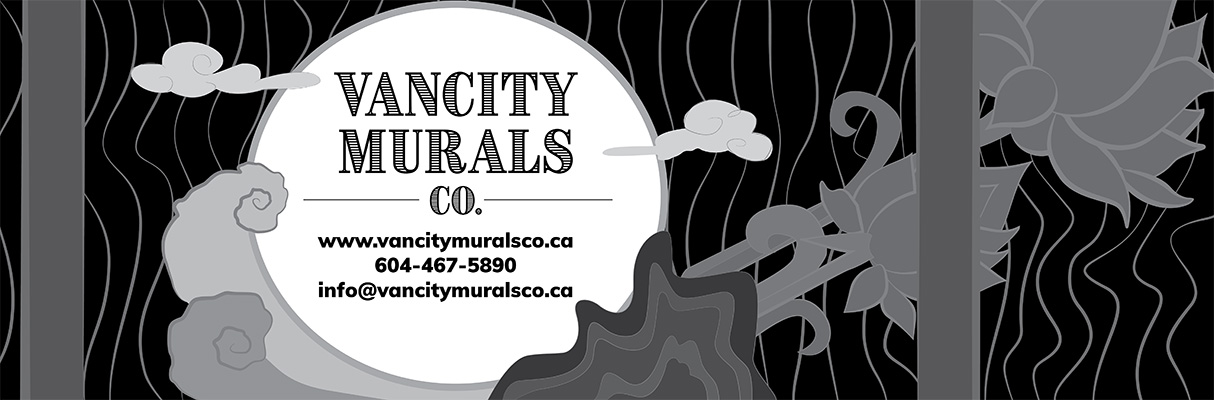
Final Logo Design
However, I found a better option for the final logo design using the typeface 'Cinzel' (see 'Typography' sub-section under 'Design Elements' for further explanation) using a different colour scheme (see 'Colours' sub-section) to make the branding really stand out.
![]()
Typography

- Romanesque serif with decorative characters
- Designed by Natanael Gama with inspiration from first century roman inscriptions
- Used for the wordmark logo to make it look quite dramatic so it would stand-out from the rest of the layout
- The characters on the 'Black' font-style variation were thick enough to be able to also show patterns in the Fill colour


Rough
In Adobe Illustrator, I turned my sketch into digital format by manually creating vector graphics using the Pen Tool. The achromatic rough design allowed me to distinguish differences in 'value' (range of lightness and darkness) which was important in designating the focal point and the rest of the visual hierarchy the client preferred.
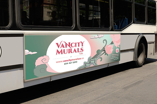
Final Bus Ad Design
Here is the final iteration of my bus ad design after the changes I made on the logo along with other changes to fine tune the layout composition. I even rendered the individual graphic elements in different ways, such as making some in 3D or using watercolour brushes, for some dramatic effect. For a more in-depth explanation of my design, see Design Rationale.

Design Elements
1) Cinzel
- Romanesque serif with decorative characters
- Designed by Natanael Gama with inspiration from first century roman inscriptions
- Used for the wordmark logo to make it look quite dramatic so it would stand-out from the rest of the layout
- The characters on the 'Black' font-style variation were thick enough to be able to also show patterns in the Fill colour

2) Seravek
- Humanistic sans-serif
- Used for the rest of the body text for a modern, and clean look
- Tends to be very readable being a humanistic sans-serif type, which is beneficial for a bus ad to effectively convey its message to the viewers
- Has a wide-variety of font styles which is good for assigning visual hierarchy due to weight differences per character
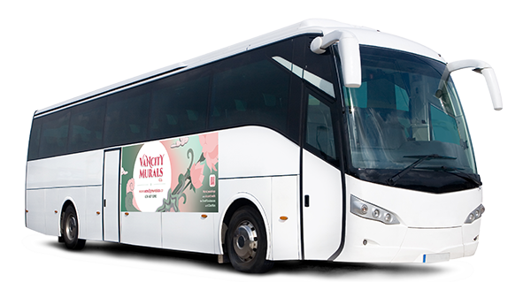 Coach bus

Shuttle bus

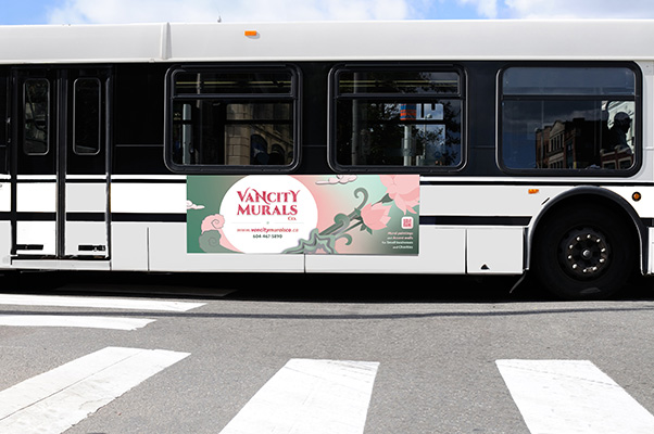
Shuttle bus for public transit around Metro Vancouver, in accordance with the final project brief
I created additional design applications for the ad design and logo, respectively, to show how they would look like on a different media. These were not part of the graded class project and were conceptualized after finishing the 'Visual Composition and Layout' course, to be featured in this portfolio.
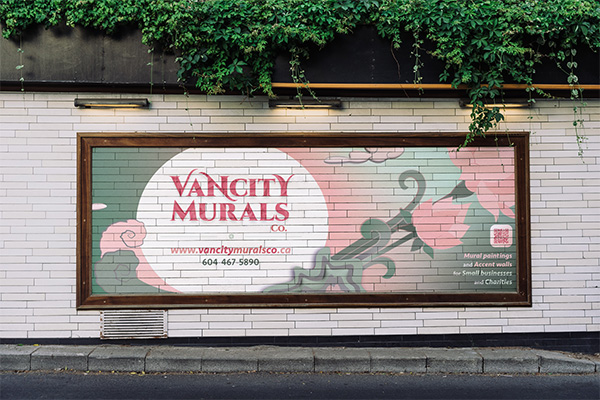
The same design for the bus ad if applied on a tiled street mural.
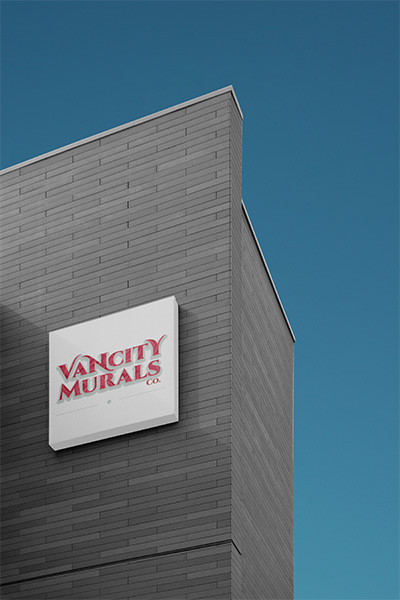
A signage mockup of the logo brand against a tall building wall

This final project for the Visual Composition and Layout course was particularly challenging as it involved working with classmates as pseudo-clients for a fictitious business they would come up with. But that kind of exercise was exactly what was needed in order to get used to working with actual clients in the future. I, myself, also had to play the part of a pseudo-client for my fellow classmates so a lot of back and forth between us had to take place, making sure we were on the right track in terms of complying with each other's design briefs. Nevertheless, it was a real pleasure dealing with my classmates especially as they had been cooperative and communicative all throughout.
I never felt so fulfilled after receiving my pseudo-clients awe and approval over my completed design. Ultimately, it was an honour to have also received the full marks (100%) for this final major project, as it validated my skills as a graphic designer being up to par with industry standards.