Aural Reef Summer Music Festival Design Campaign (2022)
Brand Identity | Visual Composition & Layout | Typography | Colour Theory
Design Brief | Research + Mood Board | Logo Development + Other Graphics & Patterns |
Main Merchandise – Vinyl Record and Sleeve Design | Other Merchandise Concepts | Reflection
Project role:
Graphic Designer (Individual class project)
- Created all project deliverables: researched information to conceptualize the genre, theme, and name of the music festival; created visual branding, persona, mood board, and logo variations; designed the layout; created vector graphics; sourced and edited raster images; sourced and applied typefaces/fonts and colour schemes; designed mockups
Programs used:
Adobe Illustrator, Adobe Photoshop, Adobe InDesign
Key skills demonstrated:
Strategic creation and use of colour, typography, imagery, and layout | Brand identity | Creative thinking | Visual problem-solving | Visual communication
For the final project in my Graphics class (MDIA 1040) at British Columbia Institute of Technology (BCIT), we were tasked to create a design campaign for a unique summer music festival based on the genre, artists, location, festival name, and merchandise of our own choosing. The following sections would expound on how I came up with the idea of an 'Aural Reef Summer Music Festival' in Maldives along with the graphic design concepts for its promotion.
Design Brief
About the Music Festival:
- Title/Name: Aural Reef
- About: An annual summer music festival held in various tropical destinations
- Music Genre: Tropical House and Neo/Avant Soul
- Summer 2022 Location: Malé, Maldives
- Mood: Modern, laidback, luxurious beach vibes
Target Market/Audience:
- Age: 20-40 years old
- Gender: All
- Price Range: High-end
- Demographic: North Americans, Europeans from the affluent social class/ high society
- Market: Exclusive beach getaway for young elites
Project Goals & Objectives:
- To create a promotional design campaign for a fictitious international summer music festival
- Such should be based on one's own unique concept, depending on the chosen genre, artists, location and festival name
Key Project Deliverable/s:
- Research & mood board
- Logo
- Brand patterns
- Promotional Merchandise: Vinyl record (final project requirement), sunglasses, sun hats, beach wear, flip flops
Research + Mood Board
previous | back to top | next
Genre and Festival Name Conceptualization
For this project we were given the creative freedom to choose a unique theme for a summer music festival; such included the music genre, festival name, venue, artist line-up, and merchandise options.
I ended up choosing a combination of Tropical House and Neo/Avant Soul genres for this design campaign. The following were the key ideas from my research on those two genres:
With a tropical beach theme in mind, here were the name choices I came up with for the chosen music genre:
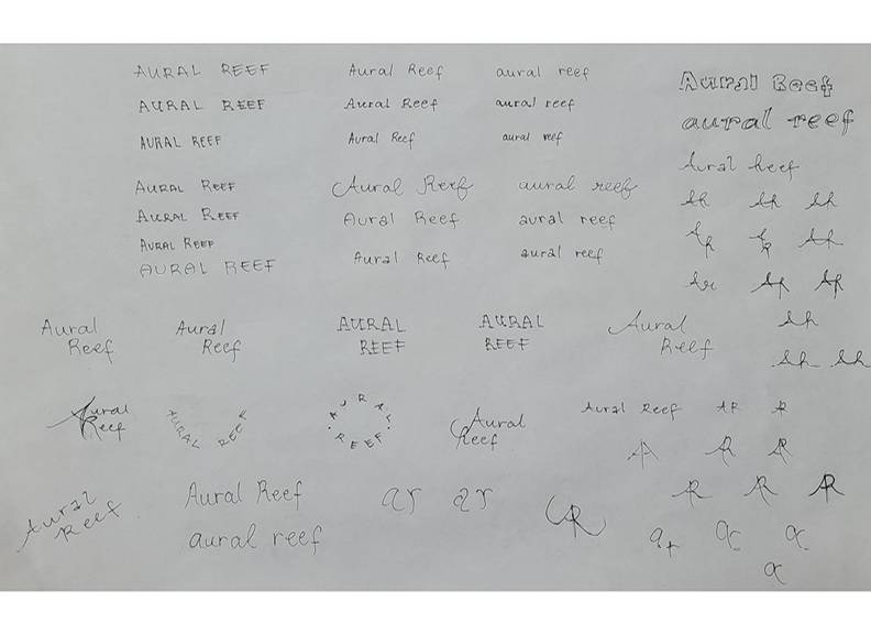
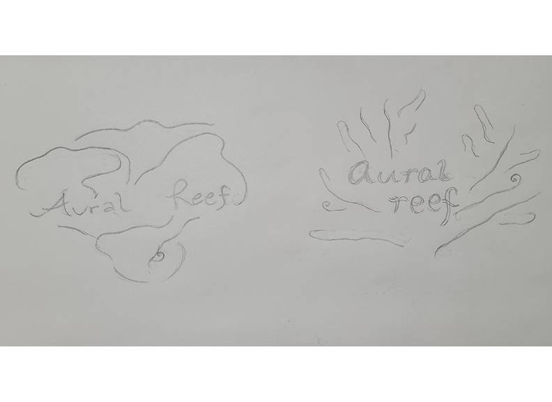
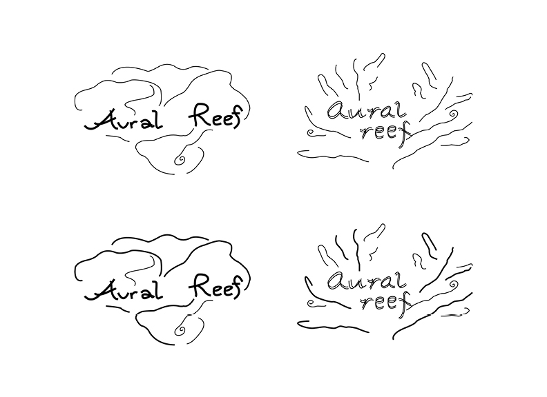
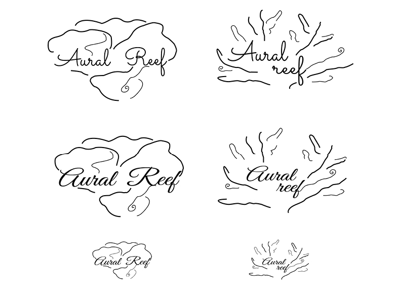
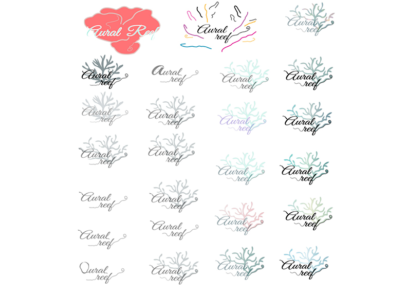
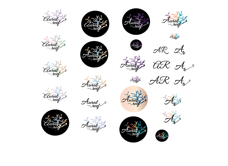
I chose the name 'Aural Reef' for the following reasons backed by research related to the concept:
About the Festival
The flip book below uncovers the necessary information about the 'Aural Reef Summer Music Festival', which includes the general information (date, venue, frequency, ticket pricing), artist line-up/ headliners, other performances, and location details.
Persona
I came up with the following personas or fictional characters based on the research I completed. They serve as representations of specific user types/segments that might be inclined to attend this kind of event. Relevant demographics for each of them were also delineated here.
Mood Board
Here is my mood board design inspired by the house and techno music festival in Belgium (Tomorrowland), the white sand beaches and water cabanas of Maldives, and the album covers of featured artists:
Logo Development + Other Graphics & Patterns
previous | back to top | next
The following sub-sections explore the design process behind the creation of Aural Reef's brand logo, followed by the graphics and pattern combinations for it.
Branding
Coming up with keywords about the brand according to culture, customer, voice, value, and benefits was an essential step prior to brainstorming ideas for the logo, as these reflect the festival’s general mood, its subculture, audience, and the value and benefits it offers to its customers.
Thumbnail Sketches
Aside from the keywords drawn during the branding process, I was largely inspired by coral reefs and other beach or underwater elements in the creation of these sketches, as well as the 'aural' or 'ear' concept of the festival name.


Roughs
Using Adobe Illustrator, I rendered my thumbnail sketches into roughs in vector graphic format. These started off as basic forms in black and white before developing into a more complex design with different colour variations.


Final Logo Design/Comp with Variations
Here were the final iterations of Aural Reef's logo design. The top row consists of the main logo in high and low contrast, and the main reef graphic in light grey.
The logos at the bottom were the coloured variations, with the first two being a combination type of logo (word mark plus reef graphic).
Design Elements
Logo with other Graphics and Patterns
In Adobe Illustrator, I combined the final logo with related graphics consistent to the theme (i.e., mermaid and fish). These further developed into patterns that can be applied to the brand's promotional materials including various merchandise that will be discussed in the next sections.
Main Merchandise – Vinyl Record and Sleeve Design
previous | back to top | next
Our final project required designs for the vinyl record and sleeve/cover of the music festival's album, featuring the songs performed live by the artists/headliners during the event.
Sleeve (back) with design rationale
Other Merchandise Design Concepts
previous | back to top | next
I selected popular summer must-have items and beach wear for the rest of the music festival's merchandise to go with its tropical theme and venue. The following were mockup designs for the merch where I applied the brand's logo variations, graphics, and patterns using Adobe Photoshop.
Sunglasses with case
For this merchandise concept, I applied the brand’s word mark on the upper left portion of each lens (left) for the sunglasses.
Then for the sunglasses cases, one has the Aural Reef pattern for a more traditional look, and another with just the logo but has the vibrant brand colours in its background for a playful variety.
Sun hats
The first style for this type of merchandise features an enlarged word mark on its brim for a bold statement, while the second one has the fish pattern with a significantly much smaller word mark for a more subdued yet fun option.
Swimwear and cover-up
For the swimwear, I intentionally placed the mermaid graphic on the side to make a portion of it visible on both the front and back sides. The word mark is applied on the upper right portion of the back side, as well.
The cover-up has the coloured combination logo on the upper left portion at the front.
Board shorts
The simple reef graphic in light grey was used to add branding on the board shorts pocket portion. The discreet placement of the logo was done for a modern and minimal look.
Reflection
Designing for a music festival out of one’s own concept was like a dream project to have. I remember feeling super excited about the whole thing that I dove straight into the initial brainstorming process just moments after receiving the design brief in class.
It didn’t take me too long to decide on which genre and theme to choose–I envisioned a music festival by the beach and I’ve been listening to a lot of house music at that time, so I thought the sub genre of tropical house would suit well for a tropical beach theme. Then I complemented it with the neo/avant soul genre as the two go really well together; both being slow in tempo with “tropical” beats and elements in the handpicked songs.
Although the overall project was quite immense, it was fortunately divided into several mini projects; we were given at least a week to complete each of them. Having it broken down in such a way did not only make tasks easier to accomplish, but we also get to immerse in and appreciate each important step of the creative process.
During that time, I haven’t taken the Adobe Illustrator course yet. But thankfully our instructor gave tutorials in-class on how to create logos using it. Using the 'pen tool' was a bit of a learning curve for me, particularly at that time, but I managed to get the hang of it and ended up producing proper designs from it.
After finishing all of the project milestones, we did a peer review amongst each other prior to the final presentation. On both occasions, I was very glad to have impressed my fellow classmates and instructor with my work, and earned a 95% grade in this final project for the ‘Graphics’ course at BCIT.