The Blue Book Magazine Ad (2022)

Project role:

Graphic Designer (Individual class project)

  • Created all project deliverables: designed the layout; created logo graphics; sourced and edited raster images; sourced and applied typefaces/fonts and colour schemes

Program used:

Adobe Photoshop, Adobe InDesign

Key skills demonstrated:

Strategic creation and use of colour, typography, imagery, and layout  |  Brand identity |  Creative thinking  |  Visual problem-solving  |  Visual communication

For the final project during my Colour Theory class (MDIA 1140) at BCIT, each student was given a unique design brief to work on, meaning not one of us has the same exact set of instructions to meet the project requirements. In my case, I was tasked to promote a book of my own choosing (real or fictitious) through a magazine ad. I decided to go for a fictitious book I named 'The Blue Book', which specifically delves on 'Monochromatic Designs', as I also had to depict a monochromatic colour scheme for my design.

Design Brief

About the Company

  • Company Name: The Blue Book
  • Service(s) or products: Book series for designers
  • Mood: Blue colour theme; professional but inviting

Target Market/Audience

  • Age: Mainly adults 18 and up
  • Gender: All
  • Price Range: Mid-range
  • Demographic: Designers (mostly visual designers like graphic and web designers) or artists and painters, from all over the world regardless of race, nationality, social class, etc.

Project Goals & Objectives

  • To promote the sale of the book ‘The Blue Book for Monochromatic Designs’ (via a magazine ad)

Key Project Deliverables

  • Company logo
  • Book Cover
  • Magazine ad (7” wide x 5” high), which could include the book cover but not just the cover design
  • Magazine ad mockup

* Pantone PMS colours must be used for the entire layout, including at least one spot colour for coated paper (the rest could either be spot or process)

* Simultaneous contrast has to be applied to a part of the ad


Rough


A simple word mark for the company logo was initially designed, to be featured in the book cover


Final Logo Design


Basically no changes were made to the rough design in finalizing the logo. The background colour here was just changed to a blue to reflect the branding.


Design Elements


Typography


  • A slab serif typeface
  • Created by Joel Kaden and Tony Stan for International Typeface Corporation in 1974, based on the slab serif style of typewriters but with a proportional design where the characters do not all have the same width


Colours


Monochromatic colour scheme
  • Tints and tones of blue
  • For a calm and trendy look

*PMS colours were used including at least one spot colour for coated paper, as per project instructions

Book Cover

Initial Book Cover Design


For the book cover, I wanted the logo branding for the book company to be front and centre, essentially becoming the layout's focal point.

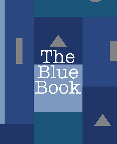
As I must apply 'Simultaneous Contrast' to a part of the ad, I decided to do that on the book cover design. Using Adobe Photoshop I created rectangular shapes in different shades and tints of blue, where the text in white looks much lighter on the dark blue background but looks darker on a light blue background.


Final Book Cover Design


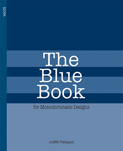
The final book cover design is a lot more toned down than the initial one. I decided to eliminate the other shapes in grey to keep the design as monochromatic as possible. Yet I made sure 'Simultaneous Contrast' would still be apparent on the much fewer rectangular shapes in various blue colours where the text in white would appear lighter against a darker blue background and vice versa.

Pantone CMYK/Process Coated colours were applied as there are more than four colours used; otherwise, it would be too expensive to use Spot or Solid colours. Coated version was used as the ad meant to be printed on glossy paper for magazine


Design Elements

Typography


1) American Typewriter
  • A slab serif typeface akin to that of a typewriter font
  • Aside from the logo, I also used this for the subhead on the book cover and the volume number


2) Montserrat
  • A geometric sans-serif typeface
  • Used for the author's name on the book cover

Colours


Monochromatic colour scheme
  • Tints and tones of blue
  • For a calm and trendy look

*PMS colours were used including at least one spot colour for coated paper, as per project instructions


Rough


Using Adobe InDesign I laid down the typographical elements according to hierarchy.

Process CMYK Coated colours were applied except for one Spot Solid Coated swatch (as per instructions), and they were specifically used for the brand’s word mark and also the QR code beside it to make sure the colour of the brand was consistent (i.e., in lieu of the original colour of the brand).


Final Magazine Ad Design


I finalized the Comp/Final Design by combining all the design elements created from Adobe Photoshop and Adobe InDesign.


Design Elements

Typography

1) American Typewriter
  • A slab serif typeface akin to that of a typewriter font
  • Present in the brand logo and the book cover's subhead text

2) Montserrat
  • A geometric sans-serif typeface
  • Used for all of the magazine ad's text content outside of the book cover

Colours


Monochromatic colour scheme
  • Tints and tones of blue
  • For a calm and trendy look

*PMS colours were used including at least one spot colour for coated paper, as per project instructions


Mockups


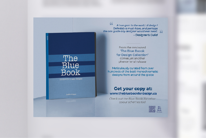
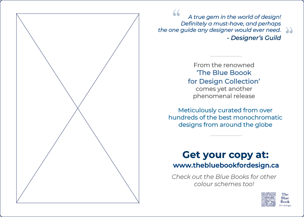
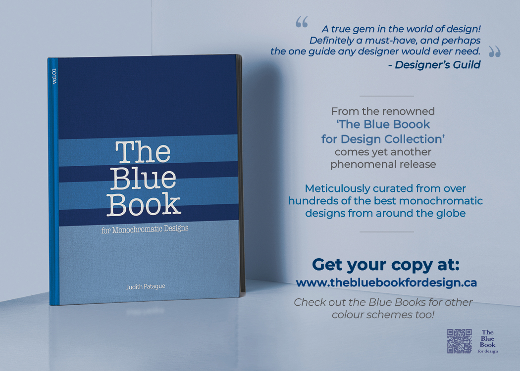
Magazine ad mockup to promote the release of the featured book


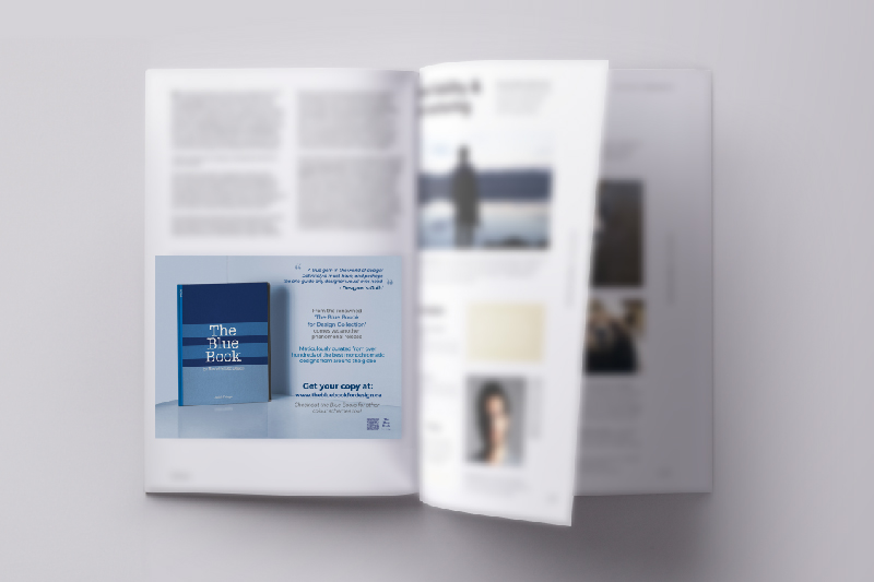
The same magazine ad mockup in a zoomed-out perspective

Design Rationale

1) Why the main colours, ie. target audience preferences/demographics, appropriateness to the nature of the product/service you are designing for? 

  • As I was tasked to use a monochromatic colour scheme, I used various tints and shades of blue here such as: 
    • Sky Blue for the background & a portion of the book cover
    • Navy blue, aqua blue, and azure blue for the shapes on thebBook cover and the text
  • By the nature of the book I’m advertising here, my target audience are designers (mostly visual designers like graphic and web designers) or artists, painters, etc.; mainly adults 18 and up; from all over the world regardless of race, nationality, gender, social class, etc.
  • Functions of the colours used:
    • Colour that evokes emotion: The predominant use of blue colour brings about calmness and peace. 
    • Colour that attracts the eyes: The stark contrast between the more saturated blue on the book cover against the background is eye-catching.
    • Colour that organizes content: The texts in blue signify the more important information, setting them apart from the ones in black/dark grey.


2) The 6 levels of Frank Mahnke’s human response to colour

A.  Biological Reactions to a Colour Stimulus 
    • Blue colour: perceived as calming; prompts meditative thinking
B. Collective Unconscious
    • Blue colour: Reminiscent of nature, such as water & sky; heavenly
C. Conscious Symbolism – Associations
    • Blue colour: Symbolizes ‘peace’
D. Cultural Influences and Mannerisms
    • Blue colour: In France, it is associated with ‘Freedom’ & ‘Peace’. In the US, it is associated with ‘Trust’
E. Influence of Trends, Fashion, Styles
    • Blue colour: Named as the ‘Colour of the Year 2020’ by Pantone
F. Personal Relationship
    • Blue colour: Most common favourite colour according to statistics


3) What is the focal point?

  • The primary focal point is the book itself, followed by the call-to-action text saying ‘Get your copy at: www.thebluebookfordesign.ca.’


4) Type(s) of Contrast used to portray the focal point

  • I used contrast of value, saturation, and size to bring out the primary focal point.
  • The use of more saturated blue colours on the book cover, being the focal point, is because:
    • For audience preference, it symbolizes dependability and stability;
    • It’s appropriate for the nature/mood of the product, as per the title itself
  • ‘The Blue Book for Monochromatic Designs’, which serves as an up-to-date guide about designs for designers.


5) What type of Harmony/Balance used?

  • I used asymmetrical balance for a modern feel to the layout
  • Other types of harmony used were similarity and order, pertaining to the monochromatic colour scheme


5) Any optical illusions used such as Bezold Effect or Simultaneous Contrast?

  • Yes, as I applied a Simultaneous Contrast on the book cover where you’ll see rectangular shapes in different shades and tints of blue. In effect, the text in white looks much lighter on a dark blue background but looks darker on a light blue background.

Reflection


During my Colour Theory Class I got to learn various colour models such as RGB, CMYK, and HSB. And as a bonus module, the Pantone colour system was also expounded on for our final project. Although getting to work on a whole different kind of colour system was a bit of a learning curve for me, I was grateful to have been taught effective methods on applying Pantone colours in the Adobe Creative Suite programs. I could see how such knowledge would be crucial in bringing about colour accuracy and ink optimization in printed designs and materials in real-life application.

The design brief I got was overall straightforward with a little bit of twist such as making sure the entire layout adheres to a monochromatic colour scheme, and demonstrates a simultaneous contrast optical illusion on a certain portion of it. Choosing blue as the main colour for my design was an easy decision having known for a fact that majority of people leans toward it. And for the simultaneous contrast, the white colour on the brand’s word mark would appear lighter or darker if I place it against different shades of blue.

The result of this project was a huge success having garnered a grade of 95% for it. But more importantly, acquiring the knowledge and skills for an important aspect of the prepress and print process in graphic design was truly valuable and definitely something I would be able to apply in actual projects in the future.

Comments are closed.