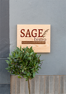
Sage Bistro Menu (2022)
Brand Identity | Colour Theory | Visual Composition & Layout | Typography
Design Brief | Logo Development | Menu Design | Other Design Concepts | Design Rationale | Reflection
Project role:
Graphic Designer (Individual class project)
- Created all project deliverables: designed the layout; created logo graphics; sourced and edited raster images; sourced and applied typefaces/fonts and colour schemes
Programs used:
Adobe InDesign, Adobe Photoshop
Key skills demonstrated:
Strategic creation and use of colour, typography, imagery, and layout | Brand identity | Creative thinking | Visual problem-solving | Visual communication
In one of the assignments for my Adobe InDesign 2 class (MDIA 2049) at BCIT, I had to complete this restaurant menu design project. We were given the liberty to individually come up with our own restaurant name and concept, of which we had to align our designs with to complement its decor, service, food quality, and price range. Using typographic elements, colours, and graphics, the resulting design should reflect the personality of the food, the drink, the ambiance, and the dining experience itself.
Design Brief
About the Company
- Company Name: Sage Bistro
- Tagline: "A pinch of passion in every dish"
- Service: Bistro
- Mood: Rustic
Target Market/Audience
- Age: All
- Gender: All
- Price Range: Mid-range
- Market: Canadians from any ethnic background
Project Goals & Objectives
- To create a well-designed menu that will serve as a communication tool for customers to know the restaurant's food and beverage offerings, and to potentially educate and entertain them. Not to mention strategically placing items on a menu is also critical for a key selling point.
- An effective menu should be designed in order to convey the sense of dining experience to the customer, in line with the restaurant's concept and image.
- Typographic elements such as glyphs, decorative elements, lines, or illustrations will be incorporated into the menu to reflect the theme of the restaurant and to add interest to the text.
Key Project Deliverables
- Restaurant logo and slogan
- Menu design (width: 10”, height: 16”) using Adobe InDesign primarily for the overall layout, with all of the provided text content and specifications
- Concepts and rules learned in class to set up an InDesign file must also be applied.
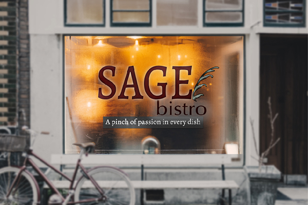
- Other design concepts (*not part of the class project requirements) – outdoor wall-mounted signage, window decal, and wood-engraved sign
Logo Development
previous | back to top | next
Restaurant Name & Slogan Conceptualization
Based on the menu items from the text provided, I envisioned a rustic bistro as a fitting choice for a restaurant concept or theme. And as for the restaurant's name, I looked up on various herbs that are commonly added to the dishes on the listed menu items. I considered 'basil', 'cilantro', 'thyme', or 'fennel' for the name but I settled with 'sage' for its 'rustic' feel as it has a strong, slightly minty and musky taste to it.
Branding
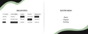
I narrowed down the final keywords, according to culture, customer, voice, value, and benefits, into three namely: rustic, organic, and inviting. Bearing such brand qualities in mind is crucial in establishing inspiration for the restaurant's logo, menu design, and other deliverables.
Rough
I created a simple combination logo design featuring the restaurant's name and a graphic representing sage leaves.
Final Logo Design
The final iteration included the restaurant's slogan, "A pinch of passion in every dish."
Design Elements
Typography
- The Alegreya type system is a "super family", which means a font family containing fonts that fall into multiple classifications including serif and sans serif sister families.
- The serif version of this type family was used to complement with the brand's characteristics (rustic, organic, and inviting).
Menu
previous | back to top | next
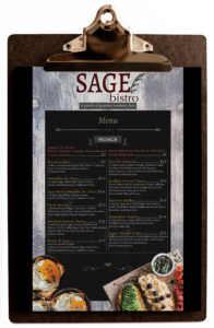
Final Menu Design
In creating the final menu design, I followed the best practices we were taught with in using Adobe InDesign which includes:
- Setting up margins, bleeds, layers, frames, columns, grids and guides for proper content placement
- Correcting punctuation and spelling errors that may be present from the text provided
- Installing fonts; formatting text and applying type hierarchy using paragraph and character styles, with no overrides (on the exceptions of tracking or kerning); applying tabs on menu items
- Adding vector or raster graphics (copyright free with credits) in CMYK; incorporating glyphs, decorative elements, colours, lines, or illustration elements to reflect the theme of the restaurant and to add interest to the text
- Saving and packaging InDesign files
Typography
Colours
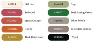
Analogous colour scheme
- Red, orange, red-orange, yellow, green; neutral colours (white, grey, and black)
- For a traditional and elegant feel that is consistent with the branding
Mockups
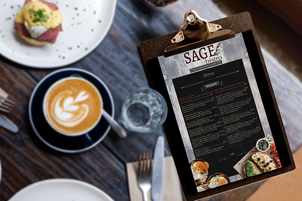
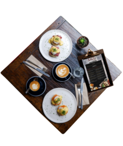
Here are the mockup designs I created to visualize how the final menu design would look like in a real-life restaurant scenario, particularly on a wooden clipboard against a rustic-looking table setting.
Other Design Concepts
previous | back to top | next
Design Rationale
previous | back to top | next
1) Why the main colours, ie. target audience preferences/demographics, appropriateness to the nature of the product/service you are designing for?
- The main colours (tones of red & orange, grey, and black) were chosen for a rustic take on the restaurant menu.
- Red, orange, and yellow are colours associated with food, evoking the tastebuds and stimulating the appetite. Thus most food-related companies (e.g., fast-food chains, restaurants, supermarkets) use them for branding, marketing, interior & exterior design, etc. to increase sales.
2) What is the focal point?
- The main focal point per menu page is/are the food image(s), as that’s what primarily grabs a potential customer’s interest and attention.
- Then it’s followed by the menu items that have bright font colours–such as red, yellow, orange– to give information on the meals or food items that are actually offered.
3) Type(s) of Contrast used to portray the focal point
- I used contrast of value, saturation, and size to bring out the primary focal point (i.e., food image/s).
- The use of more saturated/bright/lighter colours makes them stand-out against the mainly dark and neutral background per menu page.
- The varying sizes of the food, which were also laid out off-the-page, also adds contrast amongst an otherwise busy text page layout.
4) What type of Harmony/Balance used?
- I used asymmetrical balance to give a modern feel to the rustic aesthetic
Reflection

This project, taken during my advanced Adobe InDesign course at BCIT, was something I truly enjoyed as I find it fun and challenging. And thankfully, my foundation and working knowledge on Adobe InDesign were put to good use in my subsequent complex design projects such as this.
I really liked the 'planning' and 'organizing' aspect of this project, thinking about ways on how to cleverly fit the given text in a set layout. Sourcing and editing food and beverage images for the menu had been a delight, as well.
On the other hand, the more difficult aspects of this project were text and layout formatting, and converting colour modes from RGB to CMYK, as those were pretty tedious to do. Good thing we were given ample time to work on this. Helpful tips and tutorials in-class were provided too so that we can confidently work on our designs.
I could not be any happier when I received perfect marks for this project after all of the hard work I put into it. Such gave reassurance about my capability to deliver successful design projects even under strict rules and limitations.


