
![]()
Basic word mark thumbnail for the logo
![]()
A rough logo design in its early stages where a stiletto boot graphic was added to add interest and a unique touch to the logo
![]()
![]()
Design Elements
The final design features a graphic of black cowboy boots silhouette with tassels, stiletto heels, and a leather floral design commonly found in horse saddles.
![]()
Typography

- A display type family
- Developed by Christian Thalmann, this type family comprises a total of 45 font files spanning 9 different visual styles (Roman, Italic, Infant, Infant Italic, Garamond, Garamond Italic, Upright Cursive, Small Caps, and Unicase) and 5 weights (Light, Regular, Medium, SemiBold, and Bold).
![]()
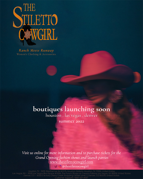
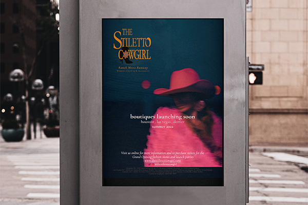
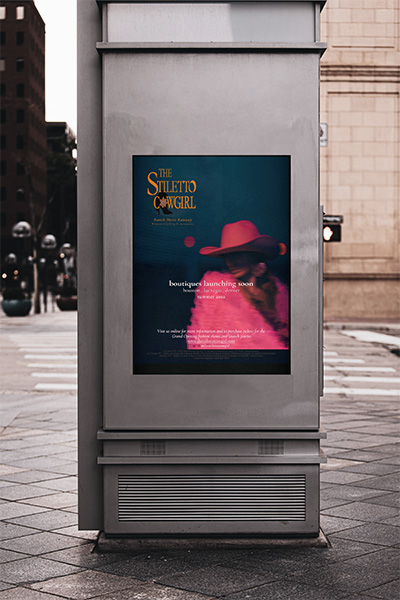
Final Poster Design
Taking into account the lessons I've learned from my 'Colour Theory Class' at BCIT, as well as my client's preferences, I was able to achieve this final design. Further explanation of the idea behind my work would be found under the 'Design Rationale' section of this page.
Design Elements
1) Cormorant Garamond
- A display type family
- Aside from the logo, I also used this for the rest of the poster design for brand consistency

2) Poppins
- A geometric sans serif typeface; each letterform is nearly monolinear
- The project was developed by Indian Type Foundry (ITF), with support for both the Devanagari and Latin writing systems
- I mainly used it for the poster's footer information
![]()
Store front sign
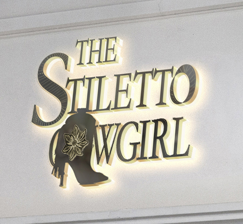
Store front sign (zoomed in)
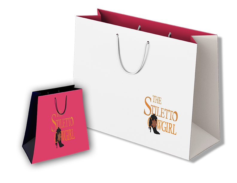
Shopping bags

This class project served as an invaluable exercise for students in preparation for when we have to deal with actual clients in the future. It not only involved the usual design work process, but also the aspect of communicating with the client. I had to constantly go back and forth with them to make sure I'm on the right track in creating a design they envision to have to meet their brand promotion needs.
As this was done during a 'Colour Theory for Design' course, it was such a joy to apply the concepts and principles I learned about proper colour application for graphic design work, as well as visual composition and layout. It was also my very first time designing a logo from scratch. Overall, I was pleased that my client was very happy about how the design turned out to be, and that I got good marks for this project too.